
The stats page for this site has always been a private, password-gated dashboard only I ever see — a plain table plus a handful of small SVG bar charts, functional but not something I'd ever screenshot. I asked for that to change: build something that actually feels good to check in on, with the same design attention as the rest of the site. This post is what came out of that, and — since the whole point of this page is showing me who's visiting — a proper look at why it stays entirely outside what the DSGVO (Germany's implementation of the GDPR) requires a consent banner for.
Starting from a design system that already existed
Rather than reaching for a generic admin-panel look, I pulled the palette straight from this site's own tokens — the amber accent, the teal and rust already used elsewhere — and extended it with two hues already present in the AI Journey page's theme picker (a blue and a violet), so the dashboard reads as this site's command center rather than a bolted-on third-party tool. Every color pairing went through an actual colorblind-safety validator before it shipped, checking OKLab contrast between every adjacent hue rather than me eyeballing it.
For type, the numbers run in IBM Plex Mono — a technical, tabular face for anything that's actually data — paired with Inter for labels, which is what the rest of the site already uses. And it's deliberately dark-only: this is a single-purpose console I check privately, not a page that needs to adapt to a visitor's light/dark preference the way the public pages do.
What's actually in it
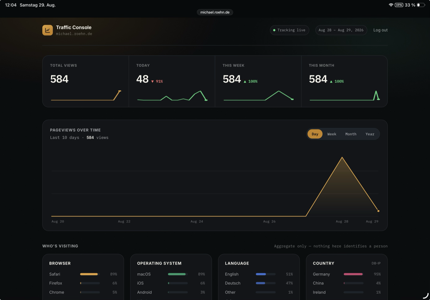
A few things worth calling out:
- Four KPI tiles up top — Total views, Today, This week, This month — each with a live count-up animation, a percentage change against the previous equivalent period, and a sparkline built from the real underlying numbers (today's sparkline is genuinely hourly, down to the hour visits actually landed).
- One chart instead of four. The old page stacked separate Daily / Weekly / Monthly / Yearly charts on top of each other. Now it's a single chart with a segmented Day/Week/Month/Year control, a real hover crosshair, and a tooltip — much closer to how a chart in an actual analytics product behaves.
- "Who's visiting" as ranked lists, not more bar charts. Browser, OS, Language, and Country each get their own card, sorted by share, each bar a shade of that card's one accent color rather than a wall of competing hues — because within one card, what matters is rank, not identity.
- A page-performance table with a proper referrer-source legend, so a color swatch is never the only way to read what it means.
Everything animates in on load, and every number is exactly what the old plain-table version showed — this was a presentation rewrite, not a new tracking system.
The part that actually matters: is this DSGVO-safe?
Short answer: yes, and not by accident — the entire tracking pipeline behind this page was already built around a single rule: classify, then discard. The dashboard just presents the result more nicely; it doesn't change what gets collected.
Here's what that means concretely, dimension by dimension:
No cookies, no visitor identifiers, ever. There's no tracking cookie, no session ID, nothing that lets one visit be linked to another. The beacon that fires on page load sends the page path and the browser's own document.referrer — nothing else.
No IP address is ever written to disk. The visitor's IP is used for exactly one thing — a lookup against a local country-range table — and the result (a two-letter country code shared by millions of people) is the only thing that gets stored. The IP itself never touches the filesystem.
That country lookup happens locally, not through a third party. A lot of "privacy-friendly" analytics tools still quietly hand your visitors' IP addresses to a geolocation API somewhere. This one doesn't: the range table (licensed from DB-IP, credited right on the dashboard) lives on the same server as the rest of the site, so the IP never leaves it in the first place.
Browser, OS, device, and language are all coarse categories, not fingerprints. "Chrome," "macOS," "Desktop," "English" — each of these is shared by a huge number of people. None of it is combined into a unique profile of one visitor; it's summed into daily totals and the detail is gone.
Nothing here can be tied back to a person, even in principle. GDPR's Article 4(1) defines personal data as anything that could identify a natural person, directly or indirectly. A daily count of "58 Chrome visits" or "32% from Germany" doesn't clear that bar — there's no way to reverse it into "which specific person" did anything, because the specific-person information was never kept.
That combination — no persistent identifier, no IP retention, aggregation into shared buckets before anything is written — is exactly the model that GDPR-focused analytics tools like Plausible or Fathom advertise as not requiring a cookie-consent banner, for the same underlying reason: if nothing personal is ever processed or stored, there's nothing for a consent requirement to attach to. I'm not a lawyer and this isn't legal advice, but the design was built to that standard on purpose, not as an afterthought bolted on later.
The one thing that is deliberately restricted here is the dashboard itself — it sits behind a password, for reasons that have nothing to do with visitor privacy and everything to do with keeping my own traffic numbers mine to share on my own terms.
Same site, same rules
Nothing about this redesign touches track.php or what it decides to keep — that logic was already right. This was purely about making the view into that data feel like something worth building well, using the same design system, the same care about what gets stored, and the same "less to load, less to maintain" instinct behind everything else here.